Today I was shuffling through old Minimalist Pictures of mine in the computer. I stumbled upon one particular album from where I had edited and posted two Black and White Minimalist Photos on the blog.
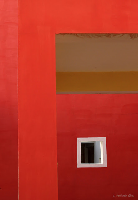
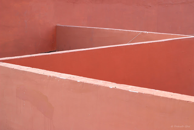
The first photo being: White Square and the second being: The Alphabet Z
Last time, when I had edited these photographs, I was not able to edit them in color the way I wanted to, hence I had turned them into black and white. But, today I thought why not give it a re-try. Today, I finally was able to edit them in color and was pretty happy with the results. A lot of people like Black and White Photographs but some only like colored ones.
With this post, I have made sure that I keep both of them happy :)
Long time ago, I had read a photography tip somewhere online and it said "Never delete a photograph ever, you may like it on a later date." I followed that advice and it worked wonders.
Another reason why I chose color today could be, that subconsciously I must be preempting a good phase in life, therefore an inclination towards color. Lets see if that happens.
Meanwhile, I am still recouping from energy that I lost from last month's Lunar Eclipse on September 16-17.
Coming back to the composition, I will not talk much about it as I had already done that in the Black and White versions.
You can read them here: a) White Square b) The Alphabet Z
Colored Version of The White Square
 |
Photo By © Prakash Ghai
|
Colored Version of The Alphabet Z
 |
Photo By © Prakash Ghai
|
Leave a comment as to which version of the Two Photographs did you like?
Colored or Black and White?
Well, That's it Folks for today!
Seasons Greetings to all.
Winters are here, take care of your health !!!

Hi Prakash. I like both BW and colored. As I love red, I prefer the first one colored, and the second BW.
ReplyDeleteThank you Angela :) Have nice day.
DeleteI like a lot of both images.
ReplyDeleteHugs
Thanks you. Hugs :)
Delete