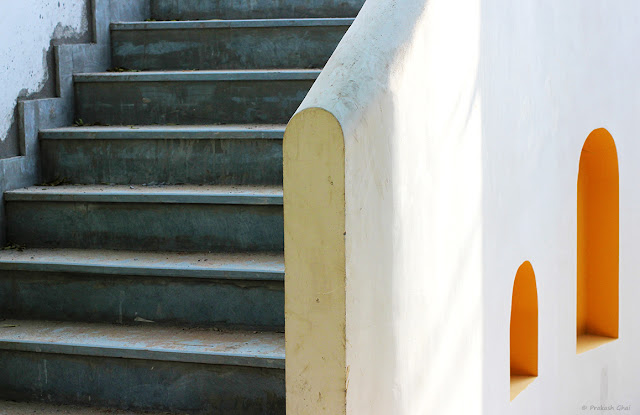
Minimalism as Simple Geometry
 |
| Photo By © Prakash Ghai Buy Now |
I am doing this post after a long time. I had been busy all this while promoting Minimalist Photography via my Instagram Page LearnMinimalism. I have been working very hard over it for the last few months and now the base work has been completed. Therefore, I have some spare time again to do blog posts. Well, Last week I was out for a photo-walk and I wanted to do a post then but I happen to jam my camera's shutter and had submitted my camera to the service center for repairs. Its only today that I got my camera back with the shutter replaced by a new one. Thankfully I had a few days of warranty left or else I would have had to pay roughly about $100. On my way back from the service center I stopped at a local coffee shop for some test shots. This is one among-st them. The cafe is really beautiful. Its a garden cafe with gravel laid down on the floor, green plants everywhere and some fascinating colors and architecture. Loved their sense of aesthetics. This staircase I spotted at the back of the cafe and what was striking was the two little yellow arcs on the right. In fact there were three of them but I took two for my composition. I titled this "Back to Heaven" as I got that feel the moment I looked at it. Of course, whether I go to Heaven or Hell depends on my Karma but I am so far happy and confident of it, hence the assumption.

Nice one.
ReplyDeleteThank you :)
DeleteWow..nice click !
ReplyDeleteThank you :)
DeleteVery nice. Thank you for sharing your photo's and words.
ReplyDeleteThank you !
DeleteI am surprised you did not mention the white rectangle of light to the left of the smaller arch that is such a wonderful element in your composition. I agree that the stairs do take care of themselves in your shot. I can relate, as a sound editor, to these kinds of focus decisions. I always enjoy your writing and work. Congrats on getting things going on Instagram. I have not yet taken that plunge!
ReplyDeleteHello Dan, Thank you.
DeleteYes I agree I forgot to mention the white rectangle and that might be because I am so used to shooting light and shadow that at times I forget to mention the intricacies. I will be frank here, the white rectangle was of course a plus but my main focus was on the juxtaposition of the arcs against the stairs(or lines) on the left. That was the highlight of the shot.
Lovely framed.
ReplyDeleteHugs
Thank you :) !
Deletenice post
ReplyDelete