Minimalism as Simple Geometry
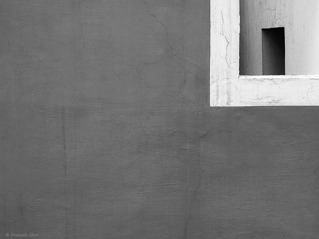
Here, geometry within geometry is placed and dimension play is used. I placed that vertical rectangular door in the top right corner, within a white square. In fact, the white square lies within another white square(i.e the white outer border). Spotting geometry is one thing and having fun with it visually is another. That is the thing about minimalist visual art. One should know how to have fun with the elements in the frame. The best was is to keep experimenting, placing the elements in different places/corners in the frame. One should also exercise caution, as sometimes, over experimentation kills the shot rather than enhancing it.
 |
| Photo by © Prakash Ghai - Buy Now |

No comments:
Post a Comment